I helped íon reach 30,000+ monthly users. I drove a 9.2% conversion rate where 4% was the goal. I measured 80% positive feedback through Likert surveys. I standardized 60+ components used by 500+ designers and 5,000+ developers across 4 tech stacks.
I'm Caique, a data-driven Product Designer with expertise in accessibility and scalable design systems, ready to bring my enterprise experience to your next challenge.
Designing íon web: accessibility, scale, data-driven decisions, and 9.2% conversion
In 2022, I helped Itaú expand their investment platform to the web. Through iterative design, accessibility work, and data-driven decisions, we reached 30,000 monthly users and hit 9.2% conversion, more than double the goal.
2022 – 2024
View
Design System·Enterprise·Scale
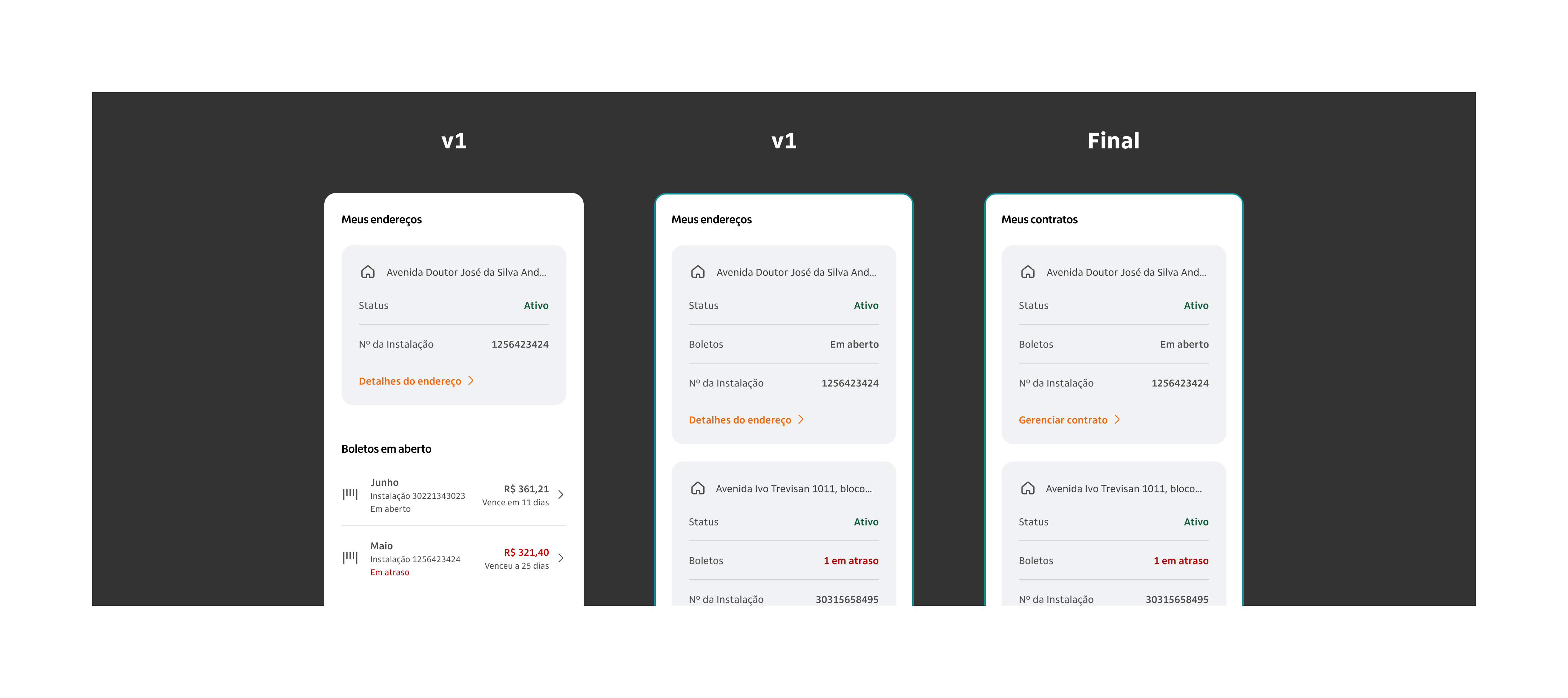
Fixing Itaú's Design System: how I analysed and standardized 60+ components from design to code
In 2024, I helped NTT Data and Itaú standardize a design system used by thousands. We analyzed and fixed 60+ components across Angular, React, Flutter, and Swift, improving consistency, accessibility, and delivery speed.
2024 – 2025
View
UX Research·Usability Testing·Prototyping
No budget, plenty of bureaucracy: how I built a testing process from scratch
In 2025, I needed to run usability tests for Itaú's new free energy market product with zero guaranteed budget and no direct access to clients. I found another way.
2025
View case
02About
I've spent the last years designing large-scale experiences for Itaú Unibanco, the largest bank in Latin America, across a diverse range of segments: automotive, investments, design systems, artificial intelligence, free energy market, and insurance. My work has impacted millions of users, focusing on UX, digital accessibility, and design systems that are consistent, inclusive, and high-performance. Evolving with every project, my process combines product design, user research, and human centered design to deliver clarity and business impact. I design for people.
01
UX Research & Strategy
Interviews, usability tests, data analysis and insight synthesis to ground design decisions in real evidence.
InterviewsUsability TestingJobs To Be DoneData Analysis
02
Product & UI Design
Designing digital interfaces that combine product strategy, creativity and usability · from wireframes to high-fidelity prototypes.
WireframingUI DesignPrototypingWeb & Mobile
03
Design Systems
Building and evolving scalable design systems · tokens, components, documentation and governance for teams of any size.
TokensFigma VariablesComponentsDocumentation
04
Digital Accessibility
Robust accessibility specs and audits following WCAG 2.1 criteria · ensuring inclusion without compromising visual quality.
WCAG 2.1Screen ReadersAuditSpecification
Tools & Skills
FigmaUX ResearchDesign SystemsAccessibility WCAGPrototypingUsability TestingData-Informed DesignMobile DesignWorkshop FacilitationJobs To Be DoneFigJam
Designing íon web: accessibility, scale, data-driven decisions, and 9.2% conversion
In 2022, I helped Itaú expand their investment platform to the web. Through iterative design, accessibility work, and data-driven decisions, we reached 30,000 monthly users and hit 9.2% conversion, more than double the goal.
Period
2022 – 2024
Company
NTT Data × Itaú
Role
Senior Product Designer
Scope
UX · UI · Accessibility
Itaú's investment platform was already a reference on mobile — the challenge was bringing it to the web without losing quality, consistency, or accessibility.
I joined the squad responsible for the product showcase area, working across UX, UI, accessibility, and technical alignment with development and QA teams.
We followed an iterative, data-driven approach: beta with 100 users in Dec/22, alpha with 10,000 in Jul/23, and official launch in Dec/23.
Key deliverables included the logged-in homepage, product carousels, product table, product detail page, news page, and accessibility specifications.
The result: 30,000+ monthly users (double the target), 9.2% conversion rate (the goal was 4%), and 80% positive feedback via Likert surveys.
The site was recognized as the most accessible in the Brazilian financial sector.
The challenge
A platform built for mobile, ready to conquer the web
Íon is Itaú's investment platform, already well-established in the mobile environment as a robust and sophisticated solution for investors.
The challenge was to expand this experience to the web, creating an omnichannel journey that maintained the same level of excellence, now adapted to the desktop context, and more than a simple interface adaptation, the project required rethinking flows, components, and interactions for a new usage scenario, with a strong focus on accessibility, performance, and scalability. The goal was ambitious: to reach 15,000 monthly users by December 2023.
My role
Cross-functional design at the heart of the platform
As a senior product designer, I was part of the squad responsible for the product showcase on íon web, one of the platform's most strategic areas, focused on presenting investment products in a clear, engaging, and efficient way. My role was cross-functional, ranging from UX and UI decisions to technical alignment with development and QA teams.
Conversion: I structured journeys that encouraged user engagement and decision-making, especially for complex financial products.
User satisfaction: I worked to create a fluid, intuitive, and pleasant experience, reflected in 80% positive feedback through Likert-scale surveys.
Accessibility: I actively ensured the platform was inclusive, following best practices and digital accessibility standards, which led to the site being recognized as the most accessible in the sector.
Roadmap and evolution
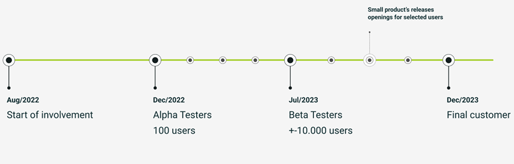
Iterating in the open, from 100 users to 30,000
My involvement in the project began in August 2022, and from the start, we followed an iterative, data-driven approach. With each new release of the platform, whether in beta, alpha, or the final launch, we collected both qualitative and quantitative feedback from users accessing the site. These insights were essential for identifying friction points, validating hypotheses, and prioritizing improvements to the features being developed.
Project timeline: from beta and alpha phases to the official launch in December 2023
Dec/22
Beta version launched
100 selected users. This phase allowed us to validate the core flows and adjust the structure of the product showcase based on early feedback.
Jul/23
Alpha expansion
~10,000 users. With a larger user base, we were able to deepen our analysis of behavior and satisfaction, refining components and interactions based on real usage data.
Dec/23
Official launch
Delivering a solid, validated, and functional MVP, ready to scale without major rework. Throughout this process, I was directly involved in analyzing the collected data, both qualitative and quantitative, to guide design decisions and ensure the product evolved consistently and with a user-centered focus.
Initial assessment
What we inherited, and what needed to change
When I joined the project, I was introduced to a comprehensive set of materials developed by the consultancy Work & Co, which had created the initial concept for what íon web could be. This work was instrumental in selling the vision to the business team and served as a starting point for development. However, upon deeper analysis, it became clear that, despite its strategic value, the material was still far from being a product ready for implementation.
Some of the main issues I identified early on included:
Misalignment with the iDS (Itaú Design System): Many of the components used did not follow the visual and functional standards of the bank's design system, compromising consistency and making technical implementation more difficult.
Lack of accessibility: Several interface elements did not consider accessibility best practices, limiting the platform's usability for people with disabilities.
Incomplete flows: Many navigation and interaction flows were only partially defined, lacking consideration for alternative scenarios, empty states, or expected behaviors in different usage contexts.
These findings made it clear that, while the consultancy's material was a strong conceptual foundation, there was still significant work needed in refinement, adaptation, and depth to turn that vision into a viable, accessible, and standards-aligned digital product.
Challenges faced
Bridging the gap between design and development
Throughout the project, I encountered challenges that required not only technical knowledge but also a strategic and collaborative approach to ensure that the deliveries were feasible and consistent. Two key points stood out.
Integration with the iDS (Itaú Design System)
One of the main challenges was the discrepancy between the design system libraries available to the design and development teams. While we, as designers, worked with an up-to-date and complete library, developers had access to an outdated version that often lacked the same components or expected behaviors. This gap required constant alignment with the tech team. In many situations, I had to:
Map what was actually available in the development stack, understanding the real limitations of the library used by the devs.
Adapt layouts and flows based on those constraints, without compromising the user experience.
Negotiate intermediate solutions, proposing visual or functional adjustments that maintained consistency with the iDS, even if the implementation wasn't 100% faithful to the original design.
This process demanded empathy, flexibility, and close communication with the technical team to ensure that the solutions were realistic while still aligned with the project's quality and experience standards.
Usability testing
Another major challenge was the strategic decision to postpone usability testing until after the launch. Due to a tight timeline and pressure to go live, we chose to validate the journeys based on best practices, internal benchmarks, and qualitative feedback during the beta and alpha phases. To mitigate these risks, I took a proactive approach:
Monitoring usage metrics and user behavior in intermediate versions.
Collecting qualitative feedback from real users during controlled testing phases.
Adjusting flows and components based on data and evidence, even before the official public release.
This approach allowed us to launch a solid, functional, and well-received MVP, even without formal usability testing prior to go-live.
Key deliverables
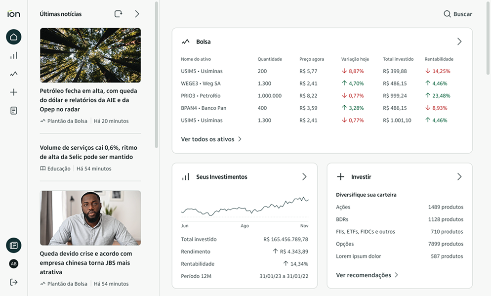
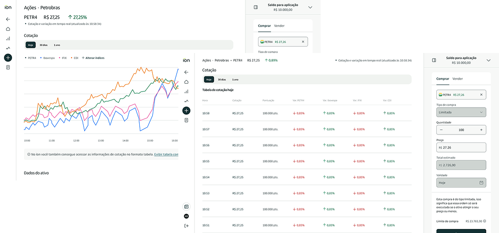
Logged-in Homepage
The logged-in homepage was designed to be the user's entry point into the íon web experience. I worked on structuring a page that balanced informative content, efficient navigation, and personalization. Key elements included:
Interactive cards with information about the stock market, the user's investments, and product suggestions.
Regulatory content blocks, integrated discreetly but accessibly.
Relevant news and updates for investors, curated automatically.
Logged-in home: portfolio cards, product carousels and curated news
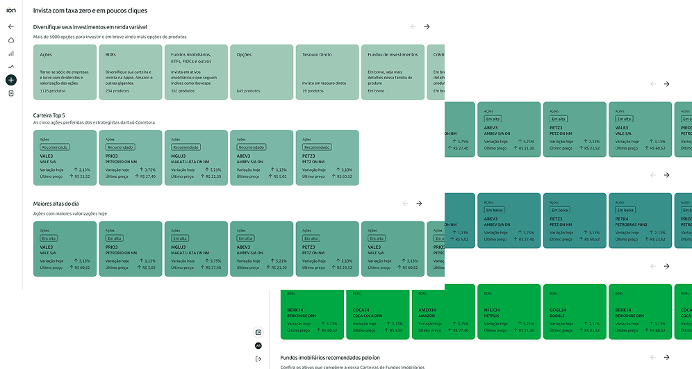
Product Carousels
The consultancy Work & Co had proposed a visual concept where each carousel would have a distinct color, forming a gradient as the user scrolled down the page. While the idea was visually appealing, the original concept included only 8 colors, which quickly proved insufficient given the number of carousels the product needed to support.
I led a study to expand this palette from 8 to 16 colors, ensuring visual harmony and accessibility. This work was done in collaboration with designer Ayrton Mugnaini. We also defined the ideal card sizes for each carousel, considering different screen resolutions and breakpoints. Together with the business team, we segmented the content and defined strategic titles for each carousel, such as:
"Diversify your investments in equities"
"Top 5 Portfolio" · "Top Gainers of the Day" · "Top Losers of the Day"
"Invest Abroad" · "Real Estate Funds Recommended by íon"
Product carousels: palette expanded from 8 to 16 colors, card sizes defined for multiple resolutions
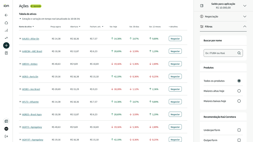
Product Table
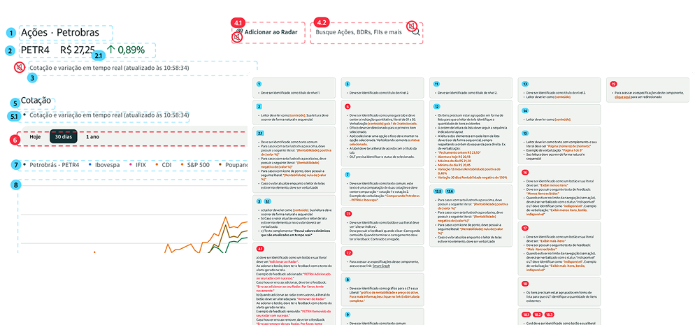
The product table needed to be robust, high-performing, and highly functional. I designed its structure with the following features in mind: real-time pricing updates, advanced sorting and filtering, responsive pagination, and visual performance indicators. I also ensured the table was fully accessible via keyboard navigation and screen readers, in line with the accessibility standards defined for the project.
Product table: real-time quotes, advanced sorting and filtering, fully accessible by keyboard and screen readers
Product Detail Page
This screen displayed specific information about an asset. The price chart required significant technical refinement in collaboration with the development team to balance technical constraints with user needs.
Additionally, this delivery had a special focus on accessibility. Since charts are not read by screen readers, I created a complementary table that translated the visual information into textual data.
Product detail: price chart with complementary accessibility table translating visual data into text
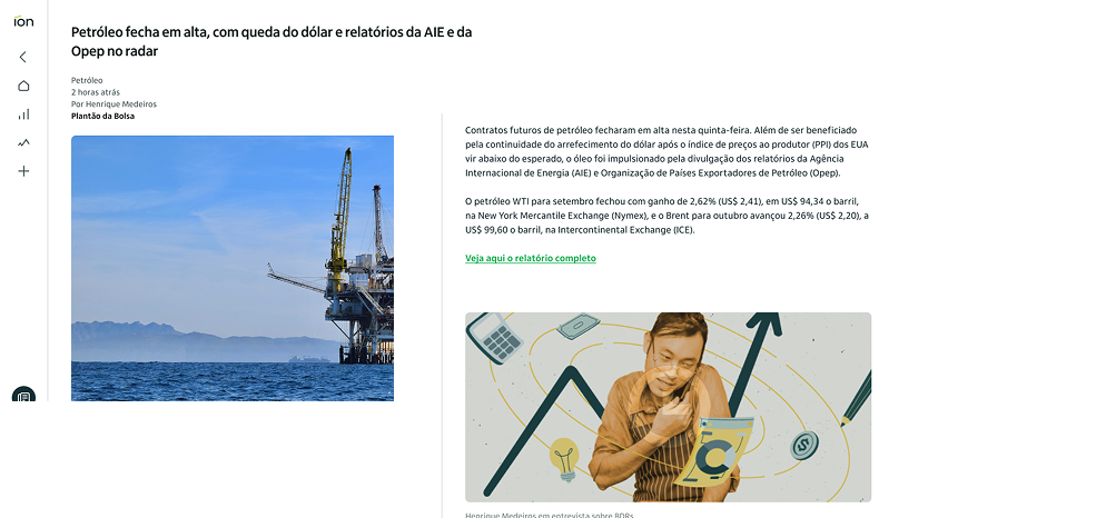
News Page
The news page was created to integrate informative content into the investment journey. I worked on structuring an internal page that allowed for smooth reading of articles, analyses, and announcements. This delivery helped position Ion Web not only as a transactional platform but also as a knowledge hub for investors.
News page: smooth reading of articles, analyses and announcements
Accessibility
This initiative was carried out in direct collaboration with the specialized team, ensuring that the solutions were inclusive and functional for all user profiles. Robust accessibility specifications were essential to guarantee that the designed solutions were viable and delivered with quality.
Accessibility specifications, developed in direct collaboration with the specialized team
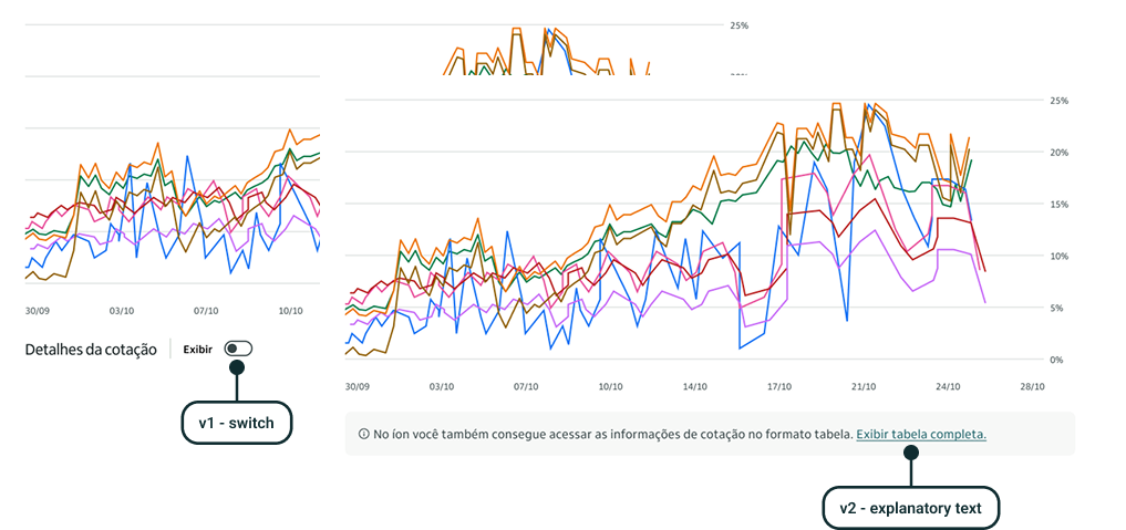
Data-driven changes
Throughout the project, we evolved several features based on two pillars: active customer listening and strategic data analysis. A standout case was the table display function for the chart. In the first version, few users knew they could activate it. With a clear and intuitive redesign, I transformed friction into noticeable engagement.
Before and after: table display function redesign driven by user behavior data
Results
Double the users, more than twice the conversion
By the end of the project, the results exceeded initial expectations, both in terms of adoption and the quality of the experience delivered. The collaborative work, combined with an iterative and user-centered approach, enabled íon web to be launched as a solid, functional, and well-received product.
+30k
Monthly active users, doubling the initial goal of 15,000
9.2%
Conversion rate, far surpassing the 4% target
80%
Positive feedback via Likert-scale surveys
30+ features delivered. The site was recognized as the most accessible in the financial sector.
Next case
Design System·Enterprise·Scale
Fixing Itaú's Design System: how I analysed and standardized 60+ components from design to code
In 2024, I helped NTT Data and Itaú standardize a design system used by thousands. We analyzed and fixed 60+ components across Angular, React, Flutter, and Swift, improving consistency, accessibility, and delivery speed.
Period
2024 – 2025
Company
NTT Data × Itaú
Role
Senior Product Designer
Scope
Analysis · Figma · Handoff · Docs
NTT DATA assembled a multidisciplinary squad to standardize and align Itaú's design system across 4 tech stacks: Angular, React, Flutter, and Swift.
As a senior designer, I was responsible for component analyses, Figma library updates, technical handoffs, and documentation on the internal design system portal.
iDS consists of 70+ components used by 500+ designers, 5,000+ developers, and 6,000+ product managers — a large-scale, high-impact initiative.
We systematically reviewed 60+ components, identifying and resolving 600+ points of concern across design, technology, QA, and accessibility.
My main contribution to the handoff process was a structured properties and variants table, adopted as the standard by the entire team.
An unexpected final phase involved revising and maintaining official documentation on the internal design system portal, completing the full delivery cycle.
Context
One design system. Four tech stacks. Thousands of people.
NTT DATA assembled a multidisciplinary squad of specialists focused on different aspects of the design system: design, mobile and desktop technology, quality assurance, accessibility, and strategy. Our primary objective was to standardize and align the four core technology stacks, Angular, React, Flutter, and Swift, while ensuring Figma components and templates remained up to date and fully optimized for designers and developers.
As a senior designer on this project, alongside one to three other designers depending on the project phase, I was responsible for conducting initial component analyses, refining designs within the core Figma library, updating technical handoff specifications, and ultimately revising the design documentation on the internal design system website. To provide a sense of scale, iDS consists of over 70 components, is utilized by approximately 500 designers, more than 5,000 developers, and over 6,000 product managers. This was a large-scale, high-impact initiative spanning nearly a year, an experience that significantly deepened my expertise in design systems and their strategic implementation.
70+
Components in the system
500
Designers using iDS
5k+
Developers and product managers
Strategy and planning
Getting 20 people aligned before touching a single component
One of the first steps in the project was a general alignment among the nearly 20 professionals involved. After initial introductions, we conducted a detailed assessment based on the client's briefings, establishing a clear understanding of the project scope and execution timeline for each area. Our primary responsibility was to systematically review over 60 designated components, analyzing them in detail, identifying inconsistencies, and implementing the necessary corrections.
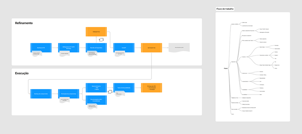
To ensure alignment on what aspects of each component we would evaluate and how far our revisions would extend, we developed initial sketches and diagrams in FigJam. These artifacts helped define our workflow and delineate the responsibility structure within the team. The workstream framework and accountability map became foundational elements guiding our approach throughout the project.
Workflow diagram and accountability map developed in FigJam, the foundational elements guiding our approach throughout the project
Component analysis
From chaos to clarity: how we built our process
Our first analysis was both the most intriguing and the most chaotic. The team focused on a single component, gathering every possible piece of information and insight. It was during this process that the design team's role in consolidating findings and creating a structured report became clear, something that had not been explicitly defined before. This approach became the foundation for all subsequent component analyses, with the design team centralizing evaluations and reporting any critical issues.
Although our initial presentation wasn't the most polished, the analysis was well received by the Itaú team, who recognized it as the first tangible value delivery. We identified key areas for improvement, including taxonomy inconsistencies, documentation gaps, and accessibility issues. It also became evident that efficient communication was essential to ensure components were developed simultaneously across multiple technology stacks. Without it, discrepancies and misalignments were inevitable.
Following the delivery of our first report and the subsequent approval of the proposed corrections, we immediately shifted our focus to implementing the necessary adjustments, refining our workflow, and preparing for the analysis of the next batch of components.
First component analysis, recognized by the Itaú team as the first tangible value delivery
Here is an example of one of the subsequent analyses we conducted, this time with a more structured approach, componentized elements, and full alignment with the client's visual identity. We consistently aimed to create deliverables that could evolve into internal tools or reference materials, ensuring we spoke the client's language and adhered to their brand guidelines, including colors, typography, and design principles.
To facilitate asynchronous reviews and ensure comprehensive documentation, we also included a final column consolidating key insights. This section provided an overall assessment of the component, highlighted inconsistencies and issues, and outlined opportunities for improvement. In case of any doubts regarding points discussed during our analysis presentation, stakeholders could simply refer to the final column for clarification.
Subsequent analysis: more structured approach, componentized elements, full alignment with the client's visual identity
Later, we had to adapt our deliverables due to timeline constraints and changes in the team structure. To streamline the process while maintaining essential quality, we developed a minimum viable version of our analysis, focusing on three core aspects for each component:
Anatomy
Properties
Design Tokens
MVA (Minimum Viable Analysis): streamlined to three core aspects while maintaining essential quality
By the end of the project, we had conducted an in-depth analysis of over 60 components and 5 templates. Throughout this process, we identified more than 600 points of concern, which were thoroughly discussed and addressed by the design, technology, QA, and accessibility teams.
Updating Figma libraries and technical handoffs
Where design meets development
After refining our workflow and completing our initial analyses, the next steps were to update the components in the bank's official Figma library and, subsequently, revise the technical handoffs. As a team, we consistently adhered to best practices at every stage, working in isolated branches for each component to ensure a structured and controlled update process.
Additionally, to facilitate the approval process and optimize time for all stakeholders, we placed component playgrounds within Figma. These interactive spaces allowed reviewers to explore components in different states and variations, often accompanied by a concise changelog summarizing the updates made.
Component playground in Figma, allowing reviewers to explore different states and variations, with integrated changelog
Once the Figma updates were finalized, we moved on to the handoff phase, one of the most critical aspects of our work as a design team. This step served as the final bridge between our improvements and the development team, ensuring seamless implementation. From the outset, the Itaú team shared with us an initial handoff model they had been using, and we quickly began refining and adapting it to fit our needs.
Ayrton Camossa, the Lead Designer of the project, transformed each section of the provided handoff model into reusable Figma components, ensuring consistency across all deliverables. This mini-library of handoff elements was carried throughout the project and significantly accelerated our workflow, maximizing the reuse of standardized elements while maintaining clarity and efficiency.
My mainly contribution for the handoff process was creating structured properties and variants table that was quickly adopted as the standard for all materials we produced. This table became a foundational element, allowing developers to clearly understand each component's full range of possibilities. While Figma's Dev Mode provides a solid foundation for developer handoffs, a well-structured example table remains an invaluable reference, eliminating ambiguities and further streamlining our process.
Properties and variants table: adopted as the standard for all handoff materials, eliminating ambiguities for developers
Additionally, we collaborated closely with the accessibility teams from both Itaú and NTT DATA to build and refine accessibility guidelines for each component. Given that accessibility is a fundamental principle of the design system, we dedicated significant effort to maintaining and even raising the system's high standards of inclusivity and usability.
Accessibility guidelines: built and refined in close collaboration with accessibility teams from both Itaú and NTT DATA
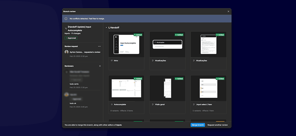
We handled both relatively simple handoffs, such as the image component example above, and highly complex ones, like the modal component example below. Regardless of complexity, we always put ourselves in the shoes of developers and QA professionals who would rely on this documentation, ensuring clarity in every aspect of a component development.
Modal component handoff: one of the most complex, with every state, variation and behavior fully documented
To finalize this phase, and in alignment with the internal guidelines set by the iDS team, we conducted all approvals and reviews using Figma's branch review tools. Since updates were automatically notified through Figma's interface and email, we maintained a clear and structured approval record at all times. Once a handoff was approved, we simply updated our Overview Panel to reflect the latest status of each step.
Overview Panel: clear and structured approval record updated after each handoff was approved
Updating Documentation
The phase no one planned for, and why it mattered
As we approached the final stretch of the project, we were unexpectedly assigned a new phase in our workflow. Beyond updating components and technical handoffs, we were now responsible for revising and maintaining the official documentation on the design system's internal portal.
This task built upon the work of another consultancy that had previously handled documentation but was now shifting to a different initiative. Since the components had been updated after their involvement, we needed to revisit these materials to ensure full alignment and consistency.
Each component went through a two-step process:
Initial validation in Figma: We updated usage examples, property tables, and instructional content. To streamline approvals, we also introduced a simplified changelog format, clearly documenting and illustrating every change, an approach we had successfully applied in other stages of our workflow.
Portal updates: We then uploaded revised images and text to the designated documentation platform, ensuring that the latest specifications were accessible to all stakeholders.
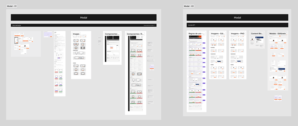
Below is an example of our modal component update (original version on the left, revised version on the right), where we meticulously reviewed every instance and application of the component. These documents are referenced daily by thousands of designers, developers, and product managers, making precision and clarity essential.
Modal component documentation update: original version (left) vs. revised version (right), referenced daily by thousands of stakeholders
Impact
600+ issues resolved. 60+ components reviewed and standardized. One system to rule them all.
Working in a multidisciplinary team required close collaboration and shared responsibility across design, development, QA, and accessibility. Strong partnerships between disciplines allowed us to analyze, refine, and update components effectively while keeping our workflow seamless.
We take pride in the impact we achieved: over 600 issues resolved across dozens of components, improving consistency, accessibility, and overall quality. Through teamwork and continuous iteration, we optimized the design system while establishing a scalable, efficient delivery process for future iterations.
More than just delivering components, we delivered clarity, trust, and a solid foundation for the design system to continue evolving with consistency.
600+
Issues resolved across dozens of components
60+
Components and 5 templates analyzed in depth
4
Tech stacks aligned simultaneously
Next case
UX Research·Usability Testing·Prototyping
No budget, plenty of bureaucracy: how I built a testing process from scratch
In 2025, I needed to run usability tests for Itaú's new free energy market product with zero guaranteed budget and no direct access to clients. I found another way.
No budget, plenty of bureaucracy: how I built a testing process from scratch
When a R$40,000 usability test was uncertain and direct access to clients was blocked by internal bureaucracy, I needed another way. The answer was the RITE method.
Period
2025
Company
NTT Data × Itaú
Role
Senior Product Designer
Scope
UX Research · Usability Testing · Prototyping
The project was part of Itaú's expansion into the free energy market, offering a 10% discount on electricity bills for individual customers spending over R$200/month.
Bureaucracy between the bank's B2B and B2C structures and the high cost of traditional testing (R$40,000) made conventional research unfeasible.
The RITE method was adopted as an alternative: an iterative testing approach that allows prototype adjustments between sessions, accelerating hypothesis validation.
6 tests were conducted across 5 prototype versions, covering the purchase and post-purchase journeys, identifying and resolving critical usability issues in real time.
Midway through the tests, the budget for the research institute was approved. RITE had already refined the journey enough to make the formal test far more efficient and precise.
The project reinforced that describing a usability problem clearly is a design skill, and that speed without judgment is not a method — it is just improvisation.
Context
A new project, an untested journey and an uncertain budget
Itaú was expanding into the free energy market, aiming to become a reference in the sector following new regulations that allow consumers to migrate from the traditional regulated market to the open market. The initiative offered individual customers spending over R$200/month on electricity the chance to save 10% on their bills, without needing to invest in their own infrastructure like solar panels.
When I joined the project, a Visioning had already been designed. I was brought in to turn it into an MVP and, at the project coordinator's request, conduct usability testing with real users, something that had not yet been done.
The challenge
We didn't know if the budget would come. So I started testing.
The project sat within IBBA, the bank's B2B structure, but the end client was Retail, a B2C structure. That difference created a bureaucratic barrier that made direct access to clients impossible. On top of that, we couldn't use Itaú's own research credits, making a traditional test with a research institute extremely expensive: around R$40,000.
The project manager was working to get the budget approved, but there was no guarantee it would happen. We needed to move forward regardless. The alternative was the RITE method.
Midway through the tests, the budget was approved. What started as a plan B became an essential part of the process: RITE refined the journey and the prototype to the point where the institute's test became far more efficient.
The method
The tool that solved the problem
RITE (Rapid Iterative Testing and Evaluation) is a usability testing approach designed to identify and fix problems quickly and continuously, during the testing process itself. Unlike traditional testing, RITE allows prototype adjustments between sessions, or even during a session, without waiting for all tests to finish before acting.
The method originated in 2002 at Microsoft Games Studios during the development of Age of Empires II. Engineers realized the development pace was too slow and needed an approach that allowed immediate iteration and implementation of improvements.
During testing, problems are classified into three categories:
Obvious cause and quick fix: corrected immediately and tested in the next session
Obvious cause but harder to fix quickly: adjustments started to be tested in the following session
No obvious cause or solution: more data needed before taking any action
In practice
Six tests, five prototypes, many discoveries
For the tests, two journeys were considered: the end-to-end purchase journey and the post-purchase journey. Based on these, I developed a test script with targeted questions aimed at validating hypotheses built by me and the business team. For recruitment, we looked for people spending over R$200/month on electricity.
We ran 6 tests across 5 different prototype versions.
What users taught us
Home screen
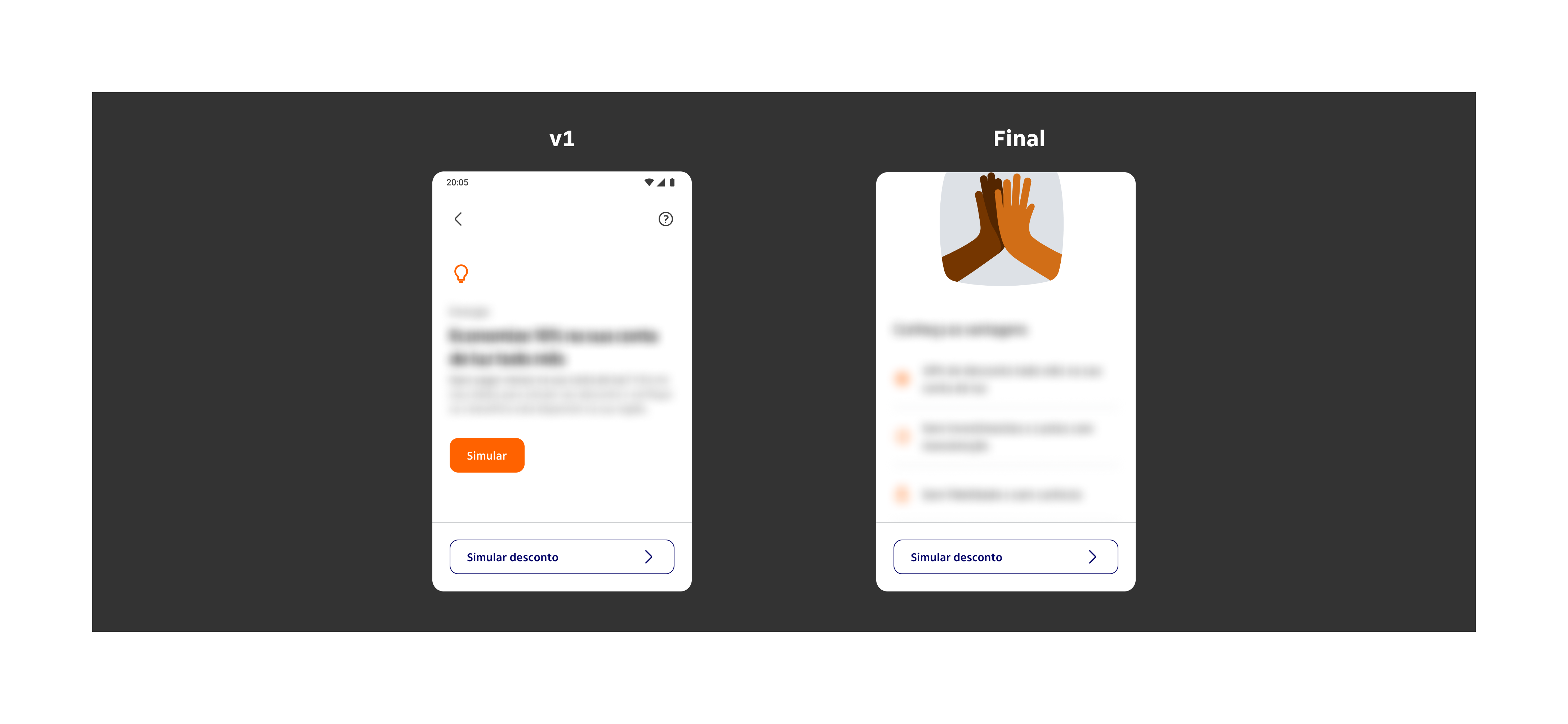
In the first version, users didn't notice there was more content below the fixed button — it was blocking the visual flow. We also identified redundancy: two buttons with the same function placed close together created confusion.
The decision was to keep the first button to gather more data on whether it was truly necessary, and move the discount simulation button to the bottom of the screen.
Home screen: v1 with fixed button blocking content flow, and final version with simulation button repositioned
Checkout screen
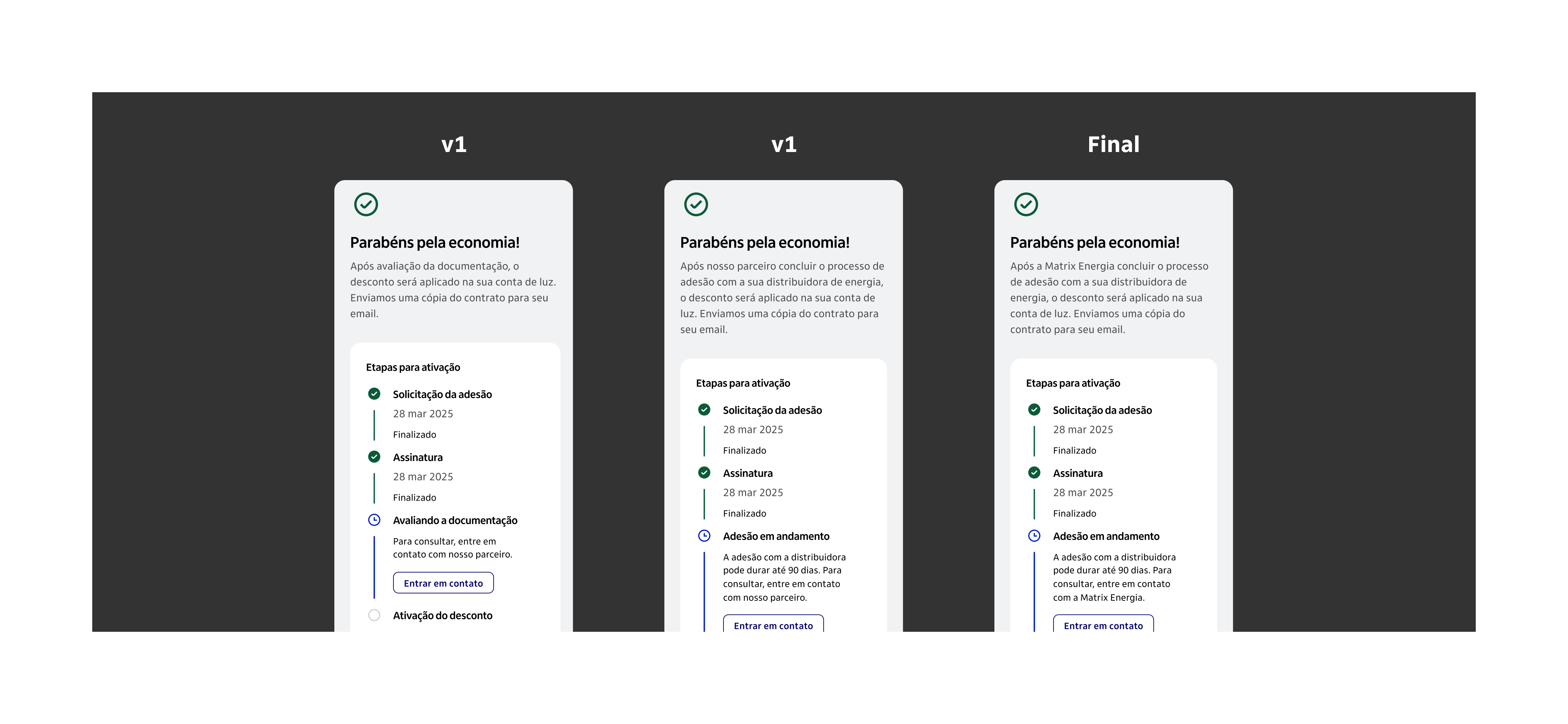
In the first test, users assumed the discount would be applied the month after signing up, which was incorrect. We updated the journey to clearly communicate that there would be an onboarding process and inform the estimated timeframe for completion.
In the next test, a new issue emerged: users had no idea who the partner behind the service was. One participant joked it was the "mystery partner." We added the partner's name to the journey.
The final version featured a closing screen with much clearer next steps in the contracting flow.
Checkout screen: from unclear partner identity and missing onboarding context to a clear closing screen with defined next steps
Product and billing cards
In the first version, the open billing section competed visually with the address card, and users felt the information was repetitive. We removed the section and moved the billing line inside the card itself.
In the next test, users could only find information like payment history through trial and error. We updated the section title and action button to be more direct.
The final version had a clearer title and a more objective call-to-action, enabling users to self-serve without friction.
Product and billing cards: from competing sections and unclear labels to a consolidated card with direct action
Product cancellation
The feedback here was sharp: having to contact the partner to cancel a service purchased through the app was considered a terrible experience. As it was a more complex issue to resolve, we decided to gather more data before building the cancellation journey.
After the tests
RITE opened the door for the definitive test
With the prototype refined through RITE, we ran a full usability testing round conducted by a research institute.
The RITE method was essential not just for validating hypotheses, but for refining the journey, the prototype, and the test script itself. This allowed the team to get the most out of the institute's testing sessions, extracting new insights with greater depth and precision.
Learnings
What I would bring to the next project
Think about context before applying RITE. Do you have time to update the prototype between sessions? Can you run multiple tests in the same day? The method only works well when there are real conditions for iteration.
Have a solid foundation. Define clear hypotheses and specific objectives before you start. Knowing what you want to discover is what makes RITE efficient, not just fast.
RITE is not chaos. Not every user error or hesitation requires an immediate change. Avoid rushed decisions: observe, analyze, and then validate.
Be agile, but responsible. Every prototype change must be thought through strategically. Agility does not mean disorganization. It means focus, judgment, and collaboration.
Next case
Product Design·Accessibility·Data Driven
Designing íon web: accessibility, scale, data-driven decisions, and 9.2% conversion
In 2022, I helped Itaú expand their investment platform to the web. Through iterative design, accessibility work, and data-driven decisions, we reached 30,000 monthly users and hit 9.2% conversion, more than double the goal.